13
min read
Anatomy of a homepage
The six-part framework we use to architect homepages for AI companies


Sofya Leonova
Co-founder + Marketing Director
A well-architected website homepage can improve conversion rates by 22%, move your rank on Google from 31st to 11th position in under two months, and increase organic search traffic 3x. Even in the age of AI search and AEO, the homepage isn’t dead.
But you have just 0.05 seconds to make a good first impression. Get it right and you create a sales engine, get it wrong and you’ve built a very expensive informational brochure no one reads, not even the robots.
Though the headlines keep asking whether websites are dead, we marketers know: all roads lead to the homepage. It’s the biggest channel we own and it’s our customers’ proverbial digital front door.
We’ve redesigned Apple’s homepage, managed Loom’s biggest website refresh, and launched a dozen websites for software startups. Over the last 10+ years of doing web work, we’ve refined and codified our framework for building the homepage of a growth-stage software company. Today we predominantly work with AI companies, so that’s who this piece is written for, though the bones of the framework hold for any software homepage.
Gather the core ingredients
As with most things in life, you get out what you put in. Whether your website works or flops depends on the quality of these core ingredients:
Positioning — are you tightly positioned to win a specific market category?
ICP — do you have a deep understanding of a singular ideal customer?
Messaging — does your copy speak your customer’s language, address their pain points, appeal to their emotions, and lead with value over product features?
Visual identity — do you have a distinct look and feel that visually communicates your positioning, makes sense to your ideal customer, and makes them feel something? Or do you look like everyone else in your category?
Content architecture — does your homepage tell a clear story that unfolds in a logical manner and answers the questions in your customer’s mind?
Each of these elements has to be strong on its own for them to come together into a homepage (and website) that meets your goals. It’s also why it takes a village to architect, write, design, build, and launch a website that builds credibility instead of eroding it.
Start with the goal
What’s the overall goal of your website? Is it for prospects to download your app and connect their Google account? To book a call with your sales team? To understand your unique point of view about the market and sign up for your newsletter?
Then think about the journey your visitor needs to go on to decide whether they’ll take that action. Most of the time, they won’t be ready on the first visit. So think about what they need to learn, and what incremental steps they need to take, before they’ll trust you enough to take the big leap.
To answer those questions well, you need a clear understanding of who the visitor is, where they’re coming from (your VC’s email recommendation, your LinkedIn profile, ChatGPT, or your Substack newsletter), what context they already have about you, and what questions they’re looking to answer next.
When visitors used to arrive from a blue link in Google, they were discovering your company for the first time with little context. Now, if they’re coming from an AI conversation, they know a lot more about your product and the job of your homepage is to get them to their next step as quickly as possible.
Write the story
Your homepage should read like a short story, not a collection of disparate company facts and product features.
Every good story has a narrative arc. The homepage narrative arc we recommend looks like this:
Hook — What is this and why should I care?
Establishes your specific category, filters the audience immediately, and piques interest.Proof — Why should I believe you?
Provides credibility and pattern recognition.Benefit — What does it do for me?
Connects your customer’s emotional pain points to your solution.Process — How does it work?
De-risks the product by showing how simple it is to use or buy.Validation — Who else has succeeded with this?
Reassures with social proof right when the prospect is evaluating their next step.Call to action — OK, I’m interested. What now?
Removes final friction points and captures the conversion.

Hook the visitor
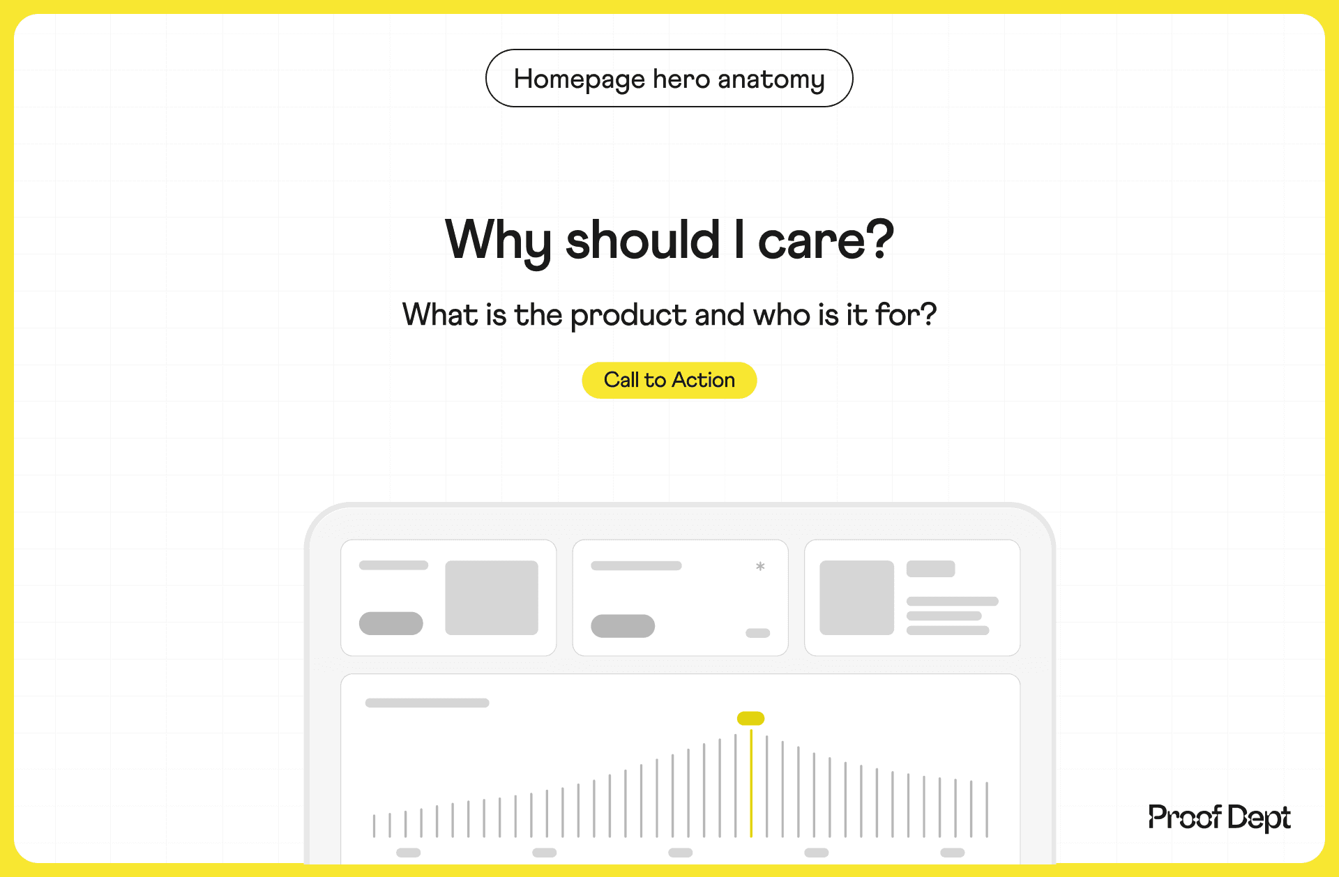
The job of your homepage hero is to set the context and hook the visitor to keep scrolling down the page. The context is your positioning — what category you’re in, who your product is best for, and what value you deliver to them. It tells the visitor where they just got dropped in and whether it’s for them. It needs to answer the questions “What is this?” and "Why should I care?”
Hero copy
You need to decide whether to lead with the what in the headline (H1) and the why in the subheadline (H2), or vice versa.
If you’re competing against established players, or entering one of the crowded AI categories where a dozen companies already make similar claims, we recommend leading with a hyper-specific what in the H1. The fastest way to anchor yourself in a customer’s mind is to name the niche you own. Don’t try to prove you’re better, and don’t sell a broad why. Slice the market until you own a distinct micro-category. Then answer the why in H2 with a line about the value your product creates for that niche and the emotional relief a customer feels once it’s working. For example:
H1 (what): The AI Video Editor for B2B SaaS Demos
H2 (why): Stop losing deals to boring product screenshots. Turn complex workflows into engaging video tours in one click.
If you’re creating a brand-new category, or you’re so early that your audience doesn’t know products like yours exist yet, flip the order and lead with the why. In a nascent market category you first need to sell your customers on a behavior shift, a new way of doing things, before you sell them on your product. Then ground it with the what in the H2, so your big vision doesn’t read as vaporware. For example:
H1 (why): Build software at the speed of thought.
H2 (what): The first voice-controlled AI development environment designed for solo founders.
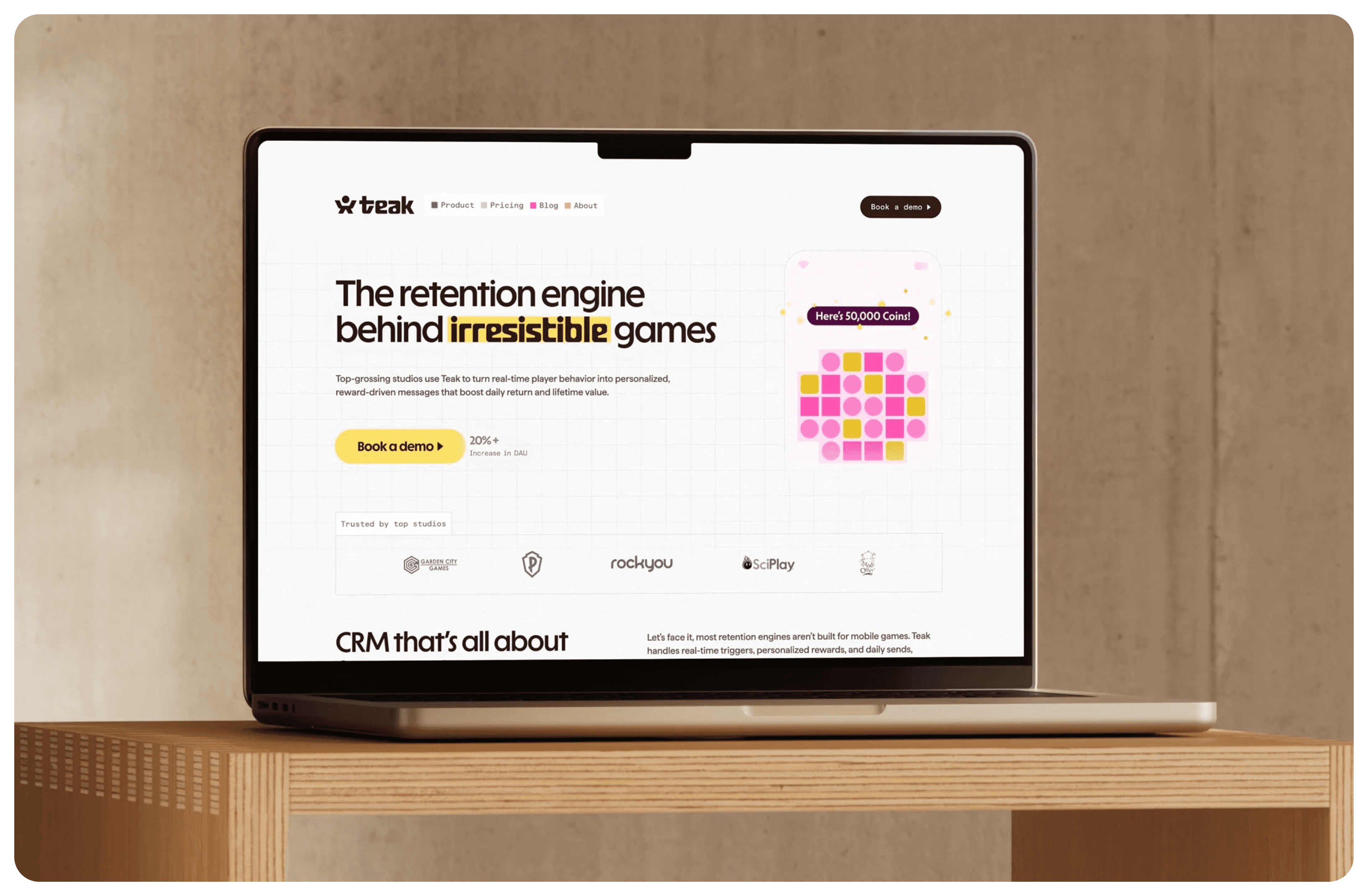
Teak’s hero from our rebrand: a category-anchoring H1, a subheadline that answer who its for and why they should care, animated auto-playing visual showing the engine in action, one dominant CTA, a performance metric, and a logo pond of studios its buyers recognize.
Hero CTA
Next, include a hero call to action (CTA) to convert your highest-intent visitors, the people who arrived ready. Feature one dominant primary button and give it your highest-contrast brand color.
If your product is complex or expensive, and the customer education journey is longer, it might make sense to include a secondary CTA. If you do include one, design it to be visibly quieter than the primary so the two aren’t competing for attention.
Hero visual
The job of your hero visual is to be the first beat of proof, evidence that your product actually exists, and show it doing the thing your headline just claimed.
If your product is self-serve, show the product UI in action, abstracted just enough to highlight the core features. Don’t paste in raw, unedited screenshots — they’re often too noisy and overwhelming. Crop tightly around the most exciting part of your UI and simplify what’s left by removing secondary navigation, sidebars, and small text.
If your software is managed or you sell to enterprises, the buyer is buying an outcome more than a piece of software, so the challenge becomes showing that outcome visually. This is where professional, bespoke illustrations come to the rescue. Work with the illustrator to figure out the clearest way to show the idea captured in your hero copy visually.
Show proof
One of the main jobs of your homepage is to build trust and credibility with your prospective customer. There are many different ways to do that and we recommend adding beats of proof strategically throughout the homepage.
One of those strategic moments is right below your hero — either above the fold if you can do so without overwhelming the hero, or right below the fold, visible on first scroll. This section’s job is to add credibility to the claims you just made in your hero copy and to allow your prospective customer to self-identify as a member of that social group.
Here are some ways to subtly signal credibility below the hero:
A logo pond of five or six logos matched to your target audience segment. A mismatched collection the customer doesn’t recognize breaks trust instead of building it.
A five-star rating paired with a customer number milestone.
A badge showing a platform ranking or a launch that went well, like a G2 category leader or a strong Product Hunt finish.
A badge naming the network your users belong to.
A single quote from a customer your market will recognize.
A customer result with a link to the case study.
Lead with the benefit
Next, you need to prove the claims you made in the hero by showing your prospective customer the benefits they will unlock and the product features that will allow them to do that.
Always lead with the benefit (why) and follow with the feature (what). The benefit is what your customer cares about, and the features are what make it believable.
Each block in this section uses this hierarchy:
The header (why / benefit): The measurable or emotional outcome.
The body (what / feature): The specific AI capability that makes the outcome possible.
The visual anchors: A contextual screenshot or micro-UI animation proving the feature exists.
For PLG motions, the benefit often focuses on speed, effort, and individual relief, because the end user is wondering: “How does this make my daily job suck less right now?” The feature focuses on UX and shows the interface they’ll be interacting with day-to-day.
Here’s an example that focuses on speed to value:
Header (why / benefit): Go from raw prompt to production-ready asset in 30 seconds.
Body (what / feature): Use the unified command bar (
Cmd + K) to instantly generate, format, and export brand-compliant assets without switching tabs.
For enterprise buyers, the benefit often shifts to scale, efficiency, risk reduction, and ROI. The executive reading your page is asking a different question: “How does this improve my department’s margins, and will it get me fired if it doesn’t work?” The feature often focuses on scale, governance, security, and administrative control.
An example that focuses on operational leverage and scale:
Header (why / benefit): Standardize brand compliance across thousands of global users.
Body (what / feature): Enterprise-wide administrative controls allow you to lock brand guidelines, approve prompt libraries, and set hard usage guardrails centrally.
Feature block element | PLG motion (end-user focus) | SLG motion (buyer/exec focus) |
|---|---|---|
Primary value metric | Time saved today / frictional relief | Cost reduction / scale / risk mitigation / ROI |
Feature focus | Smooth UX / integrations / daily workflows | Security / analytics / permissions / custom training |
Visual elements | Close-ups of the actual UI | Dashboards, audit logs, and security architecture diagrams |
A word of warning: avoid writing high-level, generic benefits that describe the entire AI category rather than your specific product like “Transform your workflow with automated intelligence” or “Drive more revenue.” Firstly, your customers don’t think or talk this way. Secondly, if your competitor could (or does) say the same thing on their page, rewrite it. You want your customer to be able to form a mental image after reading your benefit, not glaze over it because they’ve seen a version of the same claim a dozen times.
Translate abstract benefits into concrete, visual scenarios. Instead of saying “Eliminate tedious manual processes with generative assistance,” say “Generate an accurate executive summary without opening a single transcript.”
Explain the process
At this point you’ve explained what your product is and who it’s for, the benefits your customers experience and the features that drive them. Now, you want to reassure your customer that starting with your product is as easy as 1, 2, 3. They want to know that they’ll see immediate value.
With AI products, customers especially care to understand how your product works. In nascent AI categories customers are skeptical of “AI magic” and usually want a sense of what’s happening under the hood before they sign up. In established categories customers often want to know what data they need to provide, and how the data is used and stored.
We recommend breaking the process down into three simple, linear steps, framed around what the user does rather than what your backend does. For example:
Step 1 – input: What the user gives the AI (e.g., Connect your Gmail account)
Step 2 – process: What the AI does automatically (e.g., AI cleans and structures the logs)
Step 3 – output: The final reward the user gets (e.g., Get a production-ready report)
For product-led motions, this section sells the ease of using your self-serve tool, and it doubles as a preview of onboarding: if someone will need to connect a data source, you want to give them a heads-up to reduce onboarding abandonment.
For sales-led motions, this section sells the ease of doing business with you. Enterprise buyers fear long, failed implementations, so your process section has to prove that buying your product is fast, easy, and reliable.
Step | PLG motion | SLG motion |
|---|---|---|
Step 1 | Create a free account | 15-minute scoping call with an engineer |
Step 2 | Connect your Slack or GitHub | Secure deployment in your VPC |
Step 3 | Generate your first AI report | Run a 2-week custom pilot to prove ROI |
Step 4 | N/A | Full team rollout with active CSM support |
Give validation
Now that the visitor understands what your AI does and how it helps, they need to see that real people actually use it and get results.
For PLG, show raw, unedited tweets, LinkedIn posts, or short video testimonials from individual power users. The more authentic the better. And less is more. Hand-select the most impactful testimonials, don’t just dump an overwhelming “wall of love” no one is going to read.
For SLG, show case studies that lead with the results, each anchored by a quote from a named VP or Director, ideally with a photo.
If your product has a real friction point, handles sensitive proprietary data, or has a complex buying process, add a section that reassures the buyer: a short FAQ, a visual of compliance badges, or, if your pricing model is complex or there’s no free tier, a pricing table or a link to your pricing page.
If your product is low-risk, low-cost, and intuitive, skip this. You don’t want to introduce doubt where there wasn’t any.
Call to action
When your prospective customer reaches the bottom of the page, give them what we lovingly call the BoP CTA (bottom-of-page call to action): one hyper-focused final ask.
Your customer scrolled through the entire page but didn’t click the hero or top navigation button. This section’s job is to nudge them to take the next step.
Avoid boring copy like “get started today” or “sign up now.” Instead, restate your category-defining value proposition, or name the ultimate outcome they’ll miss out on if they leave.
Same rule of thumb follows here as for the hero CTA: simple product, one call to action; complex product, add a secondary CTA for those who aren’t ready to commit yet. For PLG, that might be “Start free today.” For SLG, “Schedule enterprise pilot.”
Keep this section clean and focused, but let it stand out from the rest of the homepage. It’s the final crescendo and should get the customer excited to take the next step.
Strategy type | Headline formula | Example |
|---|---|---|
Category reminder | Ready to build with [your category]? | Ready to automate your B2B SaaS demo videos? |
Outcome focused | Start [achieving core benefit] today | Start shipping compliant medical copy in minutes |
Direct invitation | Join [X number] of [target persona] | Join 4,000+ engineering leaders building with automated tracking |
Read just the headlines
Once you have a content architecture draft, read all of the headlines on their own. The headlines should reveal the story and read succinctly on their own.
You’re checking three things:
You’re not repeating the same message in every headline.
There’s a structural pattern you’re following — leading with a verb every time, or a noun — so the copy isn’t stylistically all over the place.
The narrative arc is coming through and the headlines aren’t just a wayfinding device. You don’t want your sections to be titled “How it works”, “About us”, “News.” You want headlines that describe what’s in the section and read as a story on their own.
People don’t like to read, so assume most of your visitors will skim: they read the big headlines and look at the pictures. If they only read your headlines, are they getting the story?
Here’s the exercise in action with the homepage we created for Clarify:
Less CRMing. More selling.
One click. All synced.
Prospecting and your CRM. Together at last.
The prep you’d do, if you had time
When you hang up, Clarify takes it from there.
New deals detected. None neglected.
Every follow-up, followed through.
The CRM that configures itself.
Let’s close
No headline repeats another, the rhythm is consistent, and the story comes through on its own: the CRM does the work, you do the selling. And the last line calls back to the first.
Keep iterating, for the homepage is never finished
The homepage is never a finished project — it’s an ever-evolving reflection of your company in the present day. While the anatomy generally remains the same, the content evolves together with your product as the product matures, your positioning shifts, and you earn more customers and more proof.